
Corporate design
The 5 key points
to remember from
the new charter
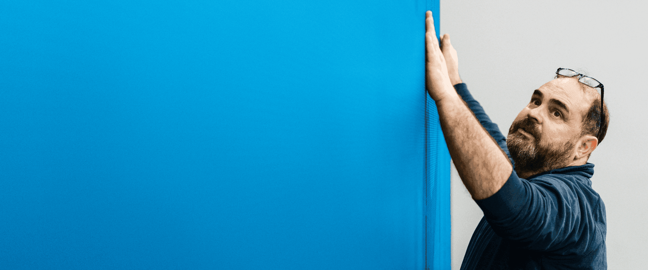
A unified blue
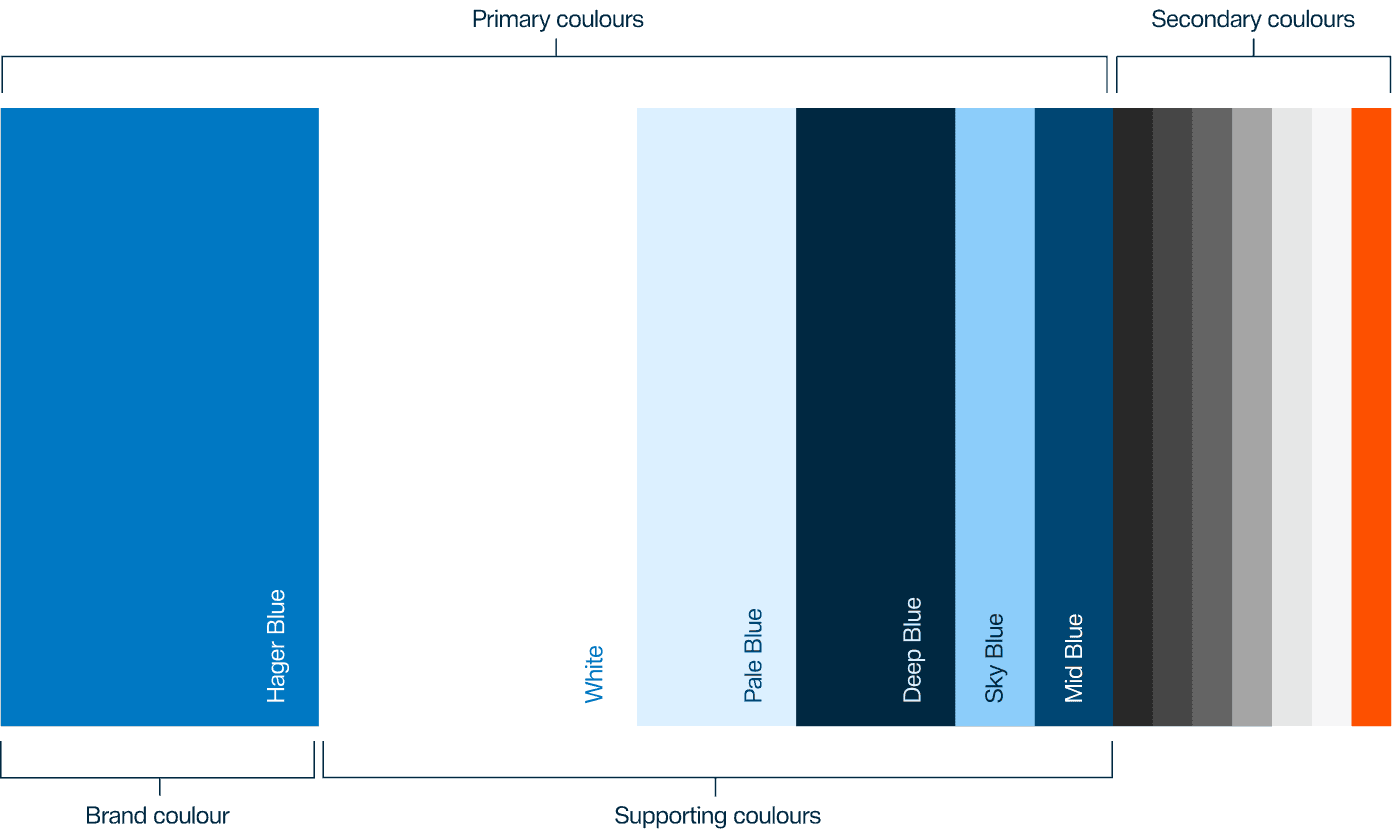
The Hager colour palette is centred around Hager Blue : our signature colour and a key element of our visual identity. Always present across communications, it is supported by five complementary blues that bring flexibility and depth. Neutral greys and a signal orange accent add contrast and balance. Across all applications, Hager Blue should remain the dominant expression, ensuring a consistent yet dynamic corporate design.
Hager Blue logo box
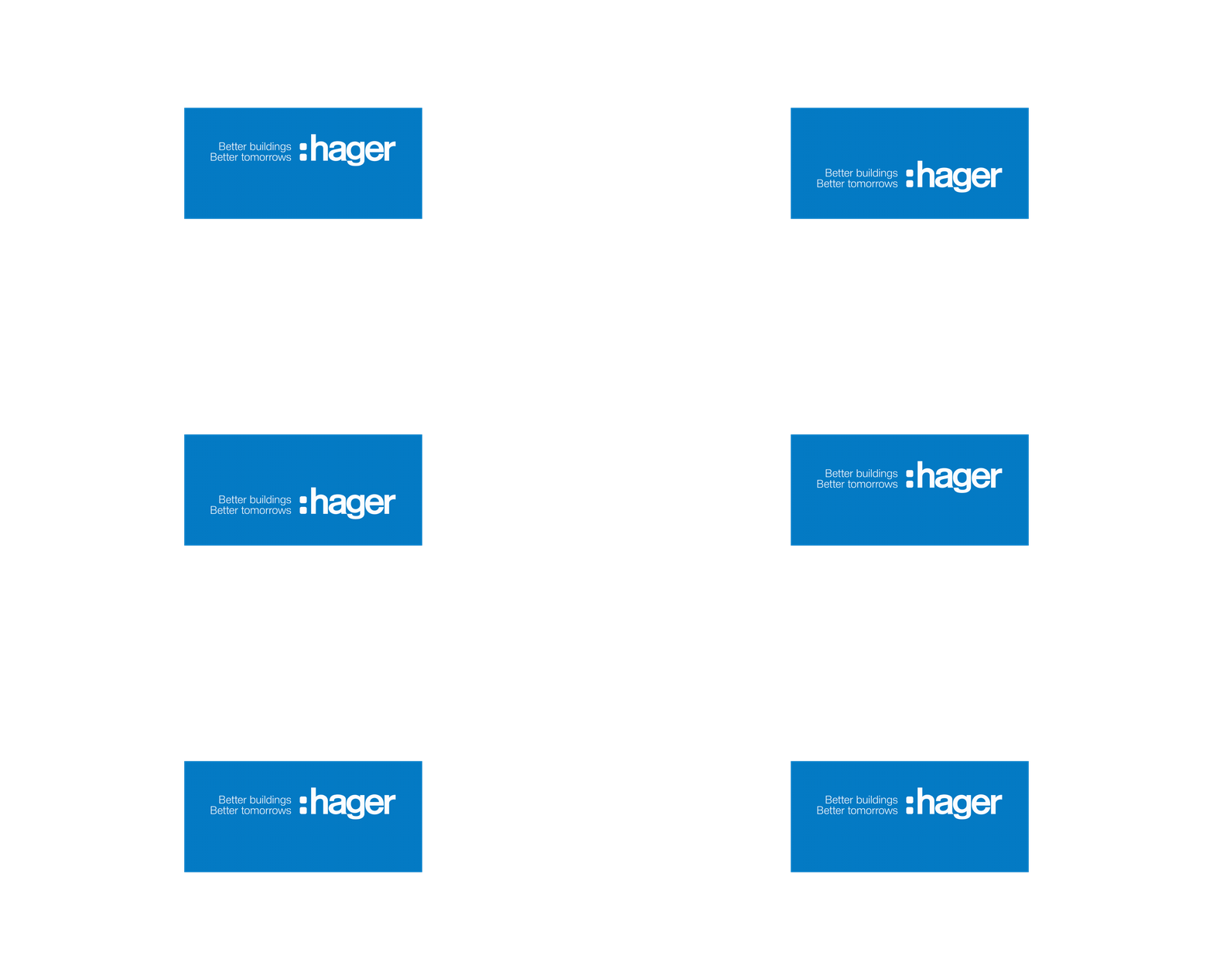
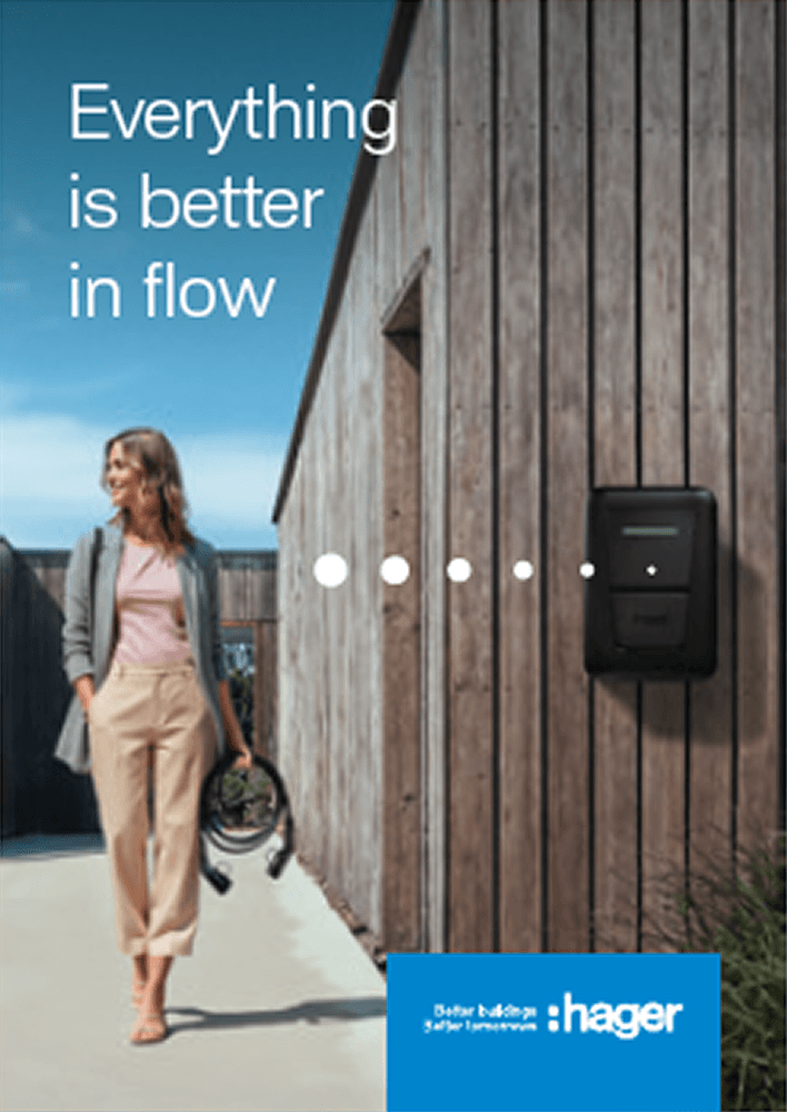
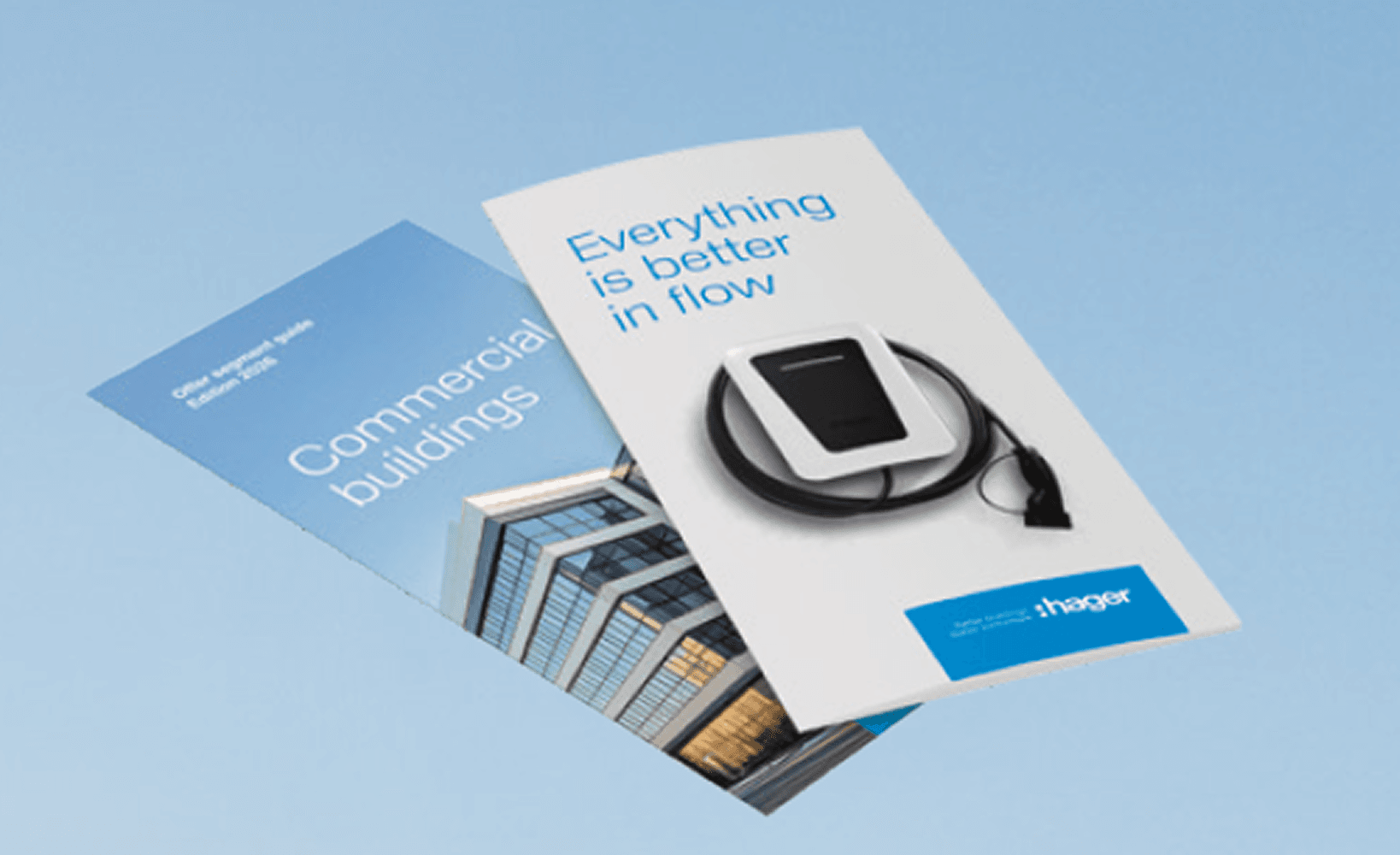
The logo with tagline brings our brand concept into communications. Framed by the Hager Blue logo box, it reinforces our visual identity and signature colour. Always aligned to the top or bottom edge, the box works across colour and photographic backgrounds. On full Hager Blue backgrounds, only the logo and tagline appear in white.
Typeface
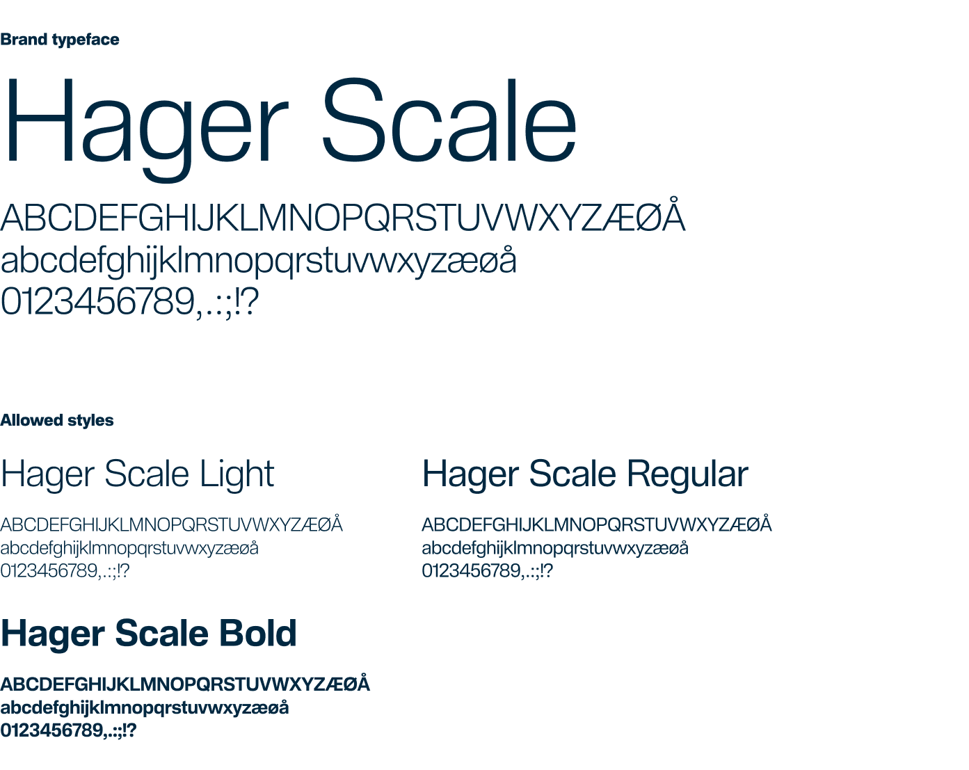
We introduce Hager Scale, our exclusive brand typeface. Rooted in the neogrotesque tradition and inspired by Helvetica, used for decades at Hager, it bridges heritage with a more contemporary expression. To maintain a light and modern tone, large and medium headlines are set in Hager Scale Light.
Hager Pulse
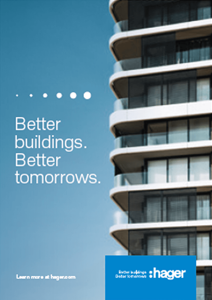
As part of our identity, we introduce the Hager Pulse, a graphic device that highlights connections across products, solutions, and messages. Built on a circular system, it should be used with restraint and clear intent, always in strong contrast to its background. It brings energy and reinforces our visual identity.

Light and asymetrical
Titles are set in Hager Scale Light to maintain a light, modern tone. Asymmetrical layouts position the logo, titles, and subtitles on the left within the margins while the brand block is positioned on the right, creating visual tension and leaving space in the center for imagery and products.